The process of Onboarding new customers is very delicate. At Renuo we know this well because we designed different onboarding systems in the last years.
There are different needs involved: you want to get all the data you need, but at the same time you don’t want to bother the customer with too many questions. You want to offer the best possible user experience, but also make it very simple. You want to validate the data as much as possible, but you also don’t want to increase the drop-rate with too many validations.
Here we will list six tips when implementing an Onboarding platform for customers.
Ask as few data as possible (aka: remove form fields)
Why are you onboarding the customer? What’s the final goal of the Onboarding Platform? Why do you need their data and which information do you really need? These are all questions you should ask yourself before deciding which type of interface to present to the customer. Don’t ask for data that you don’t need right away: you can always ask for more information later.
The more fields the customer has to fill, the higher the drop rate will be. In particular some form fields have a higher impact to the drop rate compared to others. In particular text areas and dropdowns have a powerful depressing effect. Did you know, for example, that a phone number field might decrease your conversion rate up to 48%?
Remember also to mark the required fields as such, if you have both required and non-required fields. This is very important to improve the user experience. One simple example: are you still asking for first and last name in two separate fields? Why? One “Full name” field is probably enough.
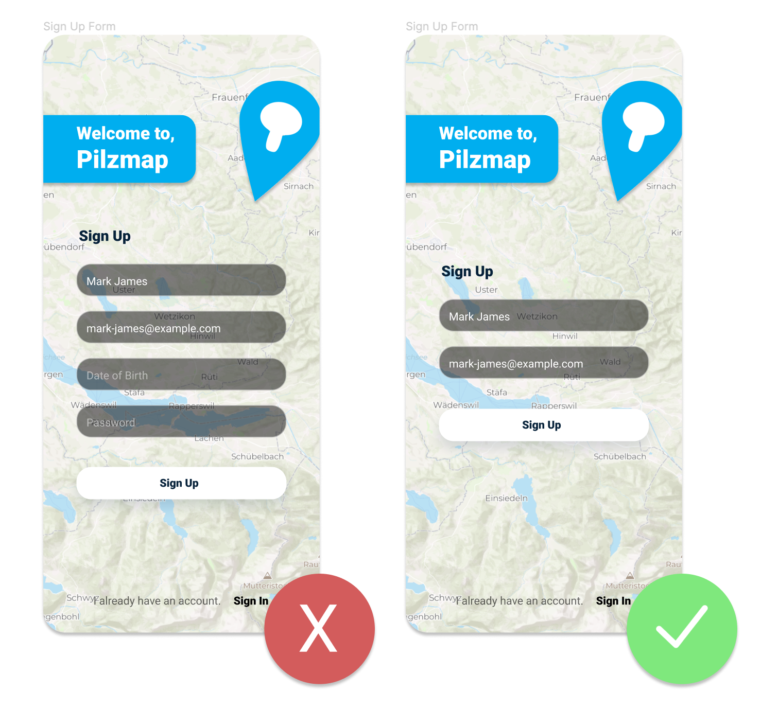
Only include fields that are required.
Traditional, Conversational or Wizards
Choose the best UI to onboard your customers:
Traditional forms are the ones we all know and love. They always existed and everyone knows how to use them. If you have a very limited amount of data to ask for, or you need particular validations, then a traditional form is the way to go. Just make sure to have it optimized for all devices and go. Still, there are many optimizations and best practices you should follow when building a traditional form, especially in terms of UI. You can find a lot of material on the web on how to properly design your forms.
Wizards are used when the amount of data required from the customer is higher. If you really need to ask many questions to the customers make sure to split your form in multiple steps and guide them through the process. Start by asking the simplest questions and leave the most complex ones (maybe they have to upload a document?) at the very end. Make sure that they can always restart from where they have left if they interrupt the process. Finally, also remember to show them their progress, so that they are exactly aware of how long is left. Progress bars give a sense of accomplishment and make the user willing to complete the procedure.
The last type of Onboarding Forms are Conversational. They are more recent and target more generations Y and Z. They have a much lower drop rate compared to Traditional Forms, but might be more complex for older people. They also are a best fit when you have a higher number of information to ask your customer than a traditional form, but still not so much to justify a wizard. Conversational forms should never pretend to “be a human”, this will only irritate your customers. Instead, they should be quick and easy to understand, and provide a good number of hints to fill the information. They are great, for example, to start a conversation right from your HomePage.
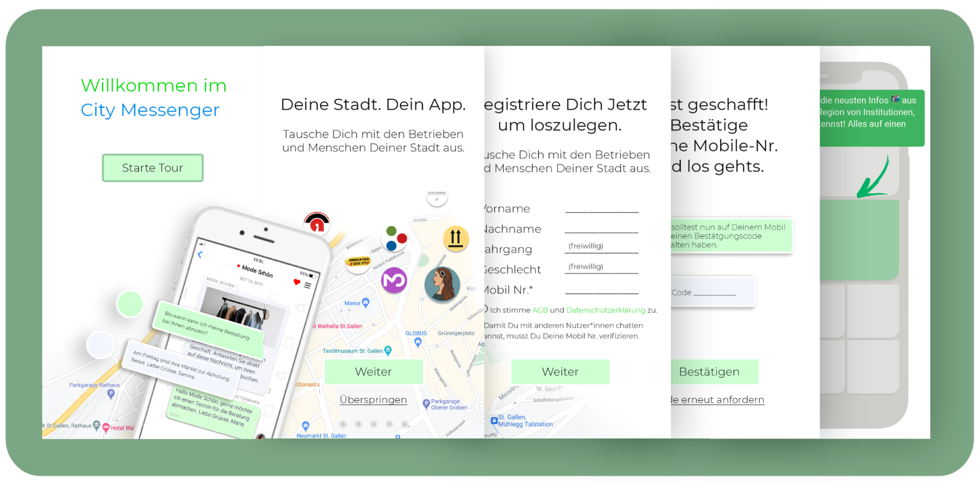
E.g. City Messenger Wizard Onboarding
Passwordless login
Passwords are a tool of the past. You don’t need to ask your customers to define a password if you have their email address. Password fields are often complex and customers get frustrated by them. Customers are also very frustrated every time they come back to your website, because most of the time they forgot the password and have to go through the “Reset my password” procedure. One great way to increase your Onboarding rate is to stop asking for the password and use the Magic Link authentication technique. Every time the customers want to login into your platform, they will simply insert their email address and receive a confirmation link in their inbox. Although this might seem to require more work from the customers on a first sight it actually ends in a much smoother experience, especially on mobile devices. So this is a good hint to remove one or two (are you still asking for password confirmations?) fields from your forms.
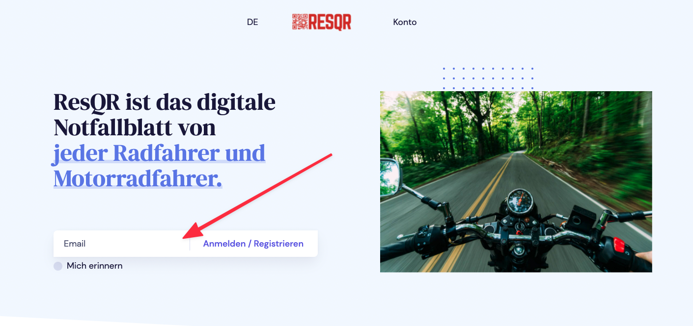
E.g. ResQR with Magic Link
As few validations as possible
The same principle of “as few fields as possible” applies also to validations. Try to keep them at the bare minimum. Auto-correct on your backend the most common mistakes that customers make and don’t bother them with corrections that can be automated. One example is the name field and the requirement “should start with a capital letter”. This can easily be fixed automatically, so don’t let the customer do it. Another example are special characters or strong password requirements. If you need to validate the inputs and you have validation errors, give feedback to the customer as soon as possible and don’t let them go back and forward on your form to fix issues.
Use inline validations, give immediate feedback as soon as they leave the field, and explain to them in detail how to fix the problem.
Capture the statistics that matter
You need to know how the onboarding process is running and when your customers drop. Capture anonymous statistics about devices used and drop-rate per device type. This will help you work on the UI for a specific device more than another.
Capture errors displayed to the customer: if the customers submit their data, and you show an error, this will increase your drop-rate. Try to avoid reaching this point, analyse what are the most common errors that happen when receiving the data and react by improving the UI and either avoid or catch these errors before the customer submits the data.
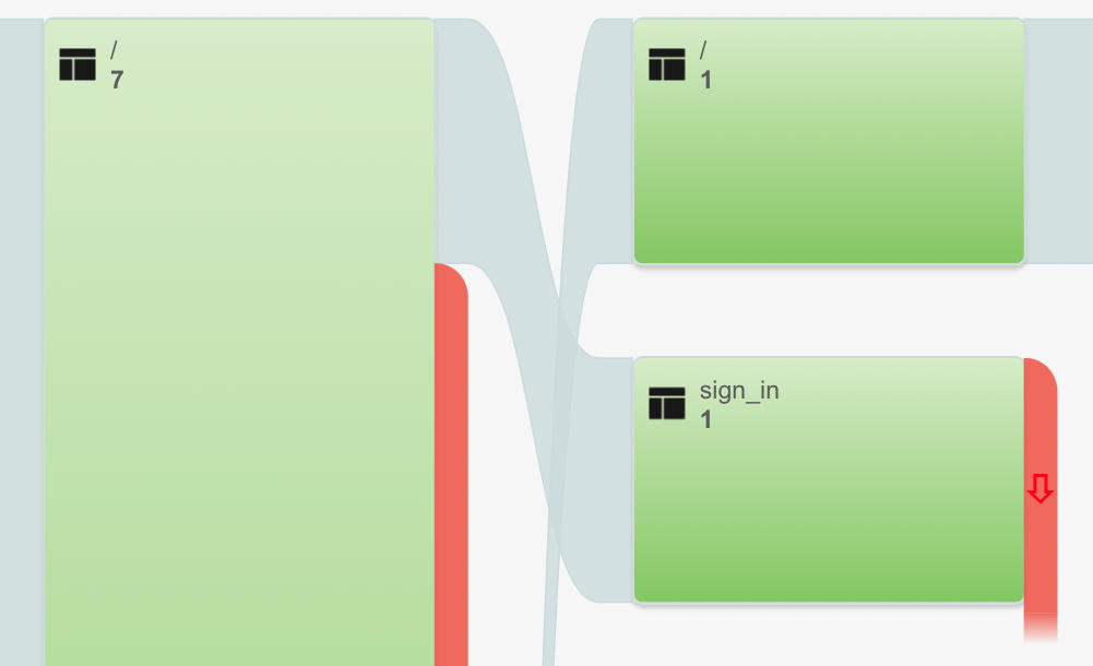
Collect all relevant data (not to few not too many)
Do not expose sensible information
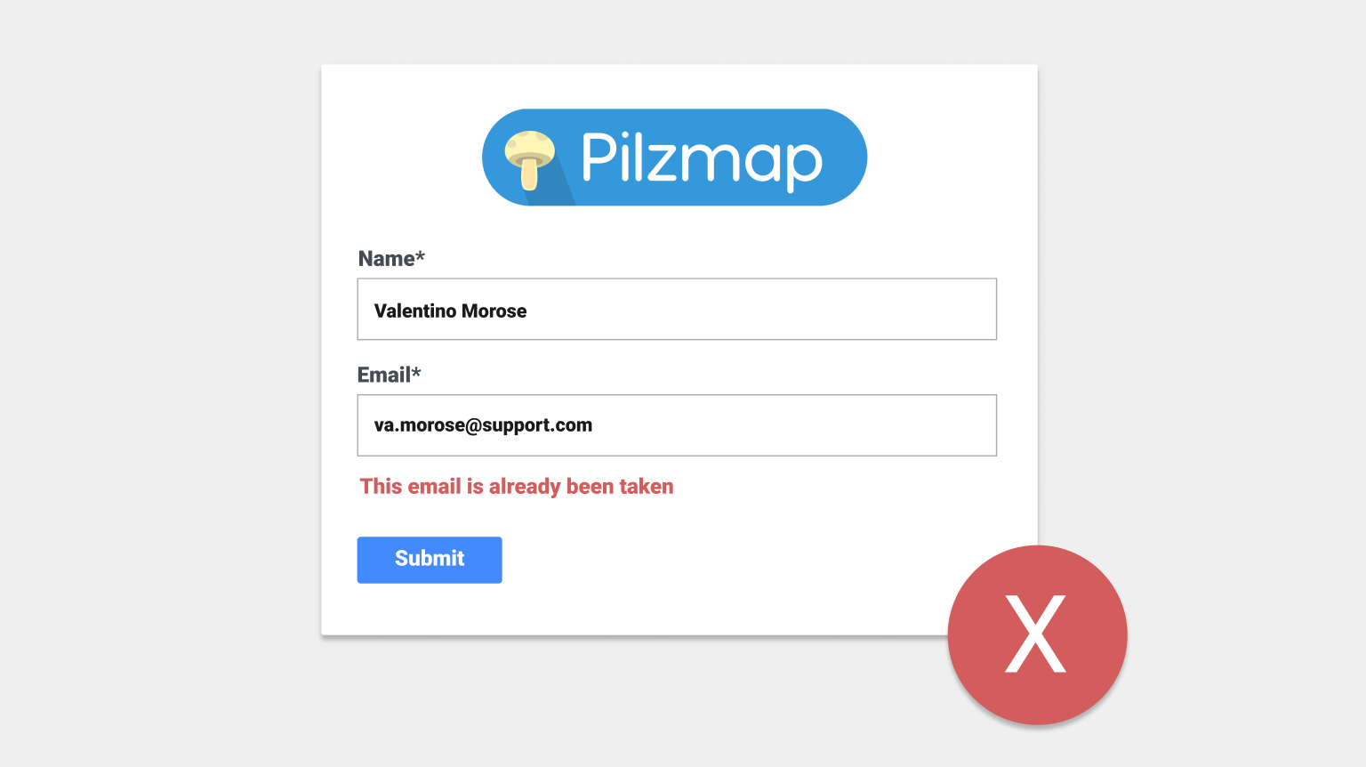
One last tip when designing Onboarding forms is to avoid exposing sensitive data. Especially when using inline validations, there’s a risk to expose too many information about already registered customers. A unique validation on the email address field that tells your customers “email already registered” might expose your entire database of email addresses.
Be cleverer than this ;).
