For a long time we have had the desire to have a new company website. At the end of 2016 we made some mockups. The goal was to have a more modern look and feel. Shortly before implementing our new solution our partner, Henry Gillis, showed us that our web page without our logo could be the page of any tech company. So we set off on a journey that began with a step backwards.
Let the journey begin!
The discussions about the mobile layout or the number of columns quickly gave way to completely different discussions: What values do we embody? What makes our company special? How do we position ourselves in comparison to our competitors? And what values do we want to convey to the outside world? Instead of the placement of the logo, it was suddenly about the logo itself: Does it reflect us? Why is the logo the way it is? And does it make sense to adapt it?
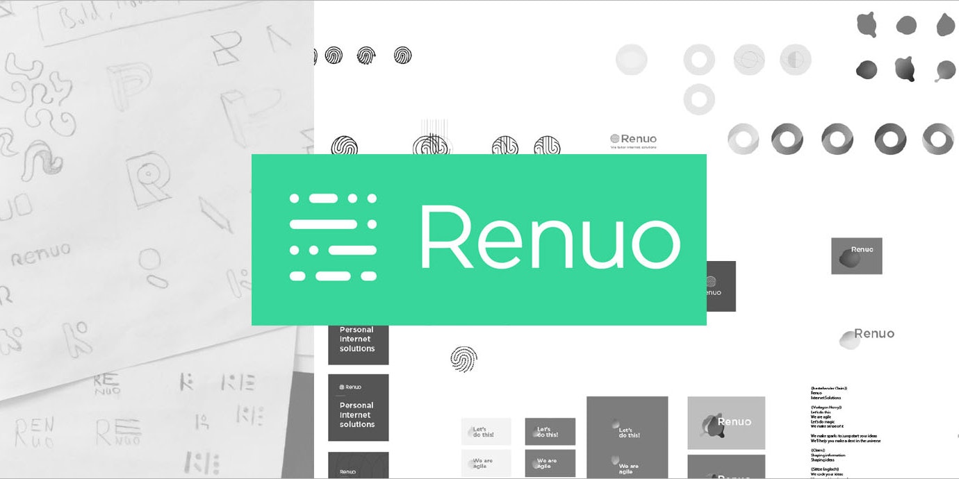
In a process that took several months, we explored different logos, lettering and colours. We discussed a lot about the effects of colours, fonts, font sizes, patterns and the combination of it all. After seven design sprints and several hours of programming, we are very happy to show you the result today.
What's the story about the new layout?
Our logo consists of lines of code. That shouldn't surprise anyone. Because our company is always on the move, our new logo can also change – at least in the digital world. Besides our core competence, the programming of web applications, it should reflect the agility and flexibility of our company. The layout of the whole website follows playful approaches in many places, which should surprise the visitors. The chosen colour, which we call «Megabyte Mint», is not an actual green. Rather, it is a mixture of blue and green that sets us apart from our competitors and gives a «techie-feel». Blue and green are also the colours that women and men alike like. When choosing a colour, it was important to us not to look for the usual connotations of a colour (for example blue = technical, logical). Rather, we first wanted to select a color and then adapt it to reflect our values. We see in the chosen color above all the sustainability, which we pursue both in writing high-quality code, but also in our daily actions.
New logo, new website, what's left?
Today we officially start with our new logo, new layout and a new website. Our values as well as our core competence – the development of high-quality software – we remain true to. Rather, we underline everything that makes us special, even more so with our new design.
I would like to thank everyone involved for the good and very intensive cooperation.
P. S. A note and little surprise for all those who have read so far. Our company has always been closely connected with Pfadi. Many of us are still active Scouts and know the Morse-Alphabet by heart ;-). Of course we couldn't help but add some morse code to our logo. We wish you a lot of fun with the unraveling of our logo icon.
P. P. S. Our new website is based on the framework Phoenix. A competence we have acquired especially for this project.


